Website design has evolved over the years, but at its core, it is still just the effective combination of both type and image to evoke emotion and desire in a user.
Words have always been powerful tools but now, as we head into 2023, innovative web designers are letting the type tell more of the story. The result is the appearance of large, more dominant typefaces that are not only the equal of images and videos but actually the star of the show.
The right font in the right place can catch our attention and make us feel something. They can give power to words and give them a totally different meaning. There is no other facet of web design that has as much subtle influence as the choice of type. So make your decision carefully.
Here, we take a look at some of the typography trends coming in 2023.
Bold & Loud Fonts
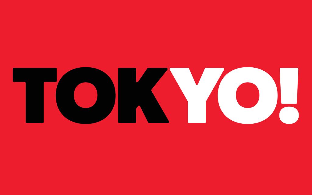
If there was one word to sum up the biggest typography trend it would be ‘dramatic’. Bold and brash is the new beautiful. Making a big impression right away is the aim of the game.
Many brands and advertisers have turned to loud type in order to make a statement. It seems there are so many things vying for our attention these days (social media, Amazon, emails, Netflix…) the only way to grab us for a meaningful amount of time is to do it bigger than anyone else.
This shift towards LOUD is part of a larger movement of using type as part of the brand imagery, rather than as just a conveyor of information. The benefits for businesses are threefold: they get to showcase their personality, people remember their name, and messaging is given centre stage.
Minimal Sans Serif
Despite the widespread return of aggressive fonts, due in part perhaps to the current mass nostalgia for the 1980s and 90s style, the minimalist movement is still going strong & is an ongoing typography trend from the last few years.
Sans serifs are generally seen as “cleaner” by designers. They are considered by many to be “non-corporate”, which might explain their popularity within the startup culture. Whatever the reason for their longevity, they are smart, unobtrusive and tell a story without being visually demanding. Especially when combined with strategic whitespace they can portray an air of exclusivity, luxury and importance in a variety of industries.
Some of the favourite sans serif fonts in the Competa Web Design office include Roboto, Poppins, Fira Sans and the classic Helvetica.
Brutalism
We live in a society where pushing limits and breaking down stereotypes is part of the norm. It’s a world of remote workers, flexi-time, political unrest and social conflict.
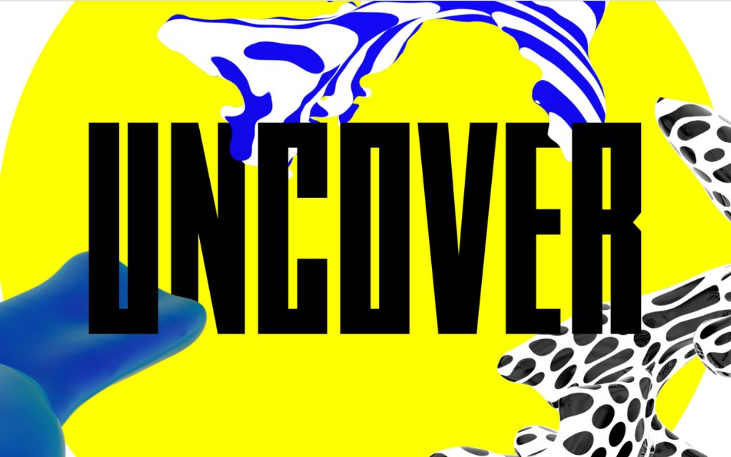
Brutalism reflects our current reality better than any of the other typography trends. It is where designers turn when they want to bend the rules of convention.
When used well, brutalism adds a sense of visual tension that can be extremely powerful, both in terms of short-term attention and long-term remembrance. And getting your brand remembered is what all of this is about.
The power of brutalism, however, is often in the eye of the beholder. Not every industry is right for it. But, in the right industry, with the right sort of personality, you can do much worse than an edgy rebelliousness that could potentially turn site visitors into brand evangelists.
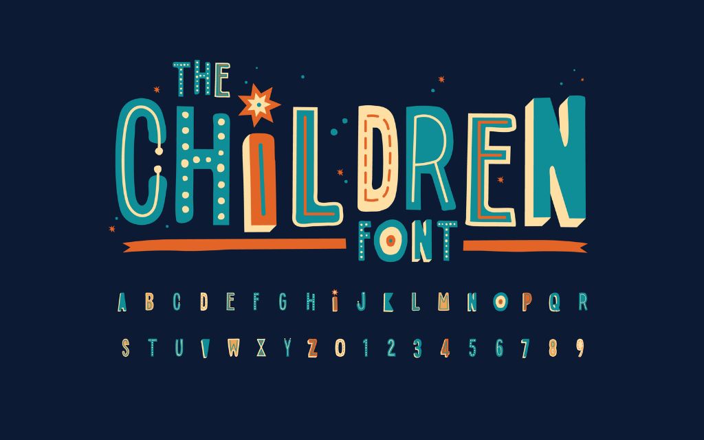
Hand-Lettering And Hand Drawn
The overarching trend of digital right now is towards personalisation. Everybody wants their consumer journey to be unique and personal to them and their preferences. Surprise, surprise – typography is beginning to reflect this.
Hand-lettering is becoming extremely popular because it adds a custom feel to something which is actually uniform.
The great thing about hand-lettering is that you give your brand a breath of personality that no one else has. You automatically differentiate yourself in the eyes of the consumer.
Animated Typography
There is a definite movement right now towards animation in typography, and this could potentially be the biggest typography trend of 2023.
We’re seeing more and more designs using fonts that move and shift with the user, again offering an interactive and immersive feel to something we (wrongly) assume will be static and underwhelming.
The best examples of animated type that we have seen don’t try to be too clever. They understand that getting the message across is the most important thing. The animation is simply a cool bonus which has the potential to delight new customers..
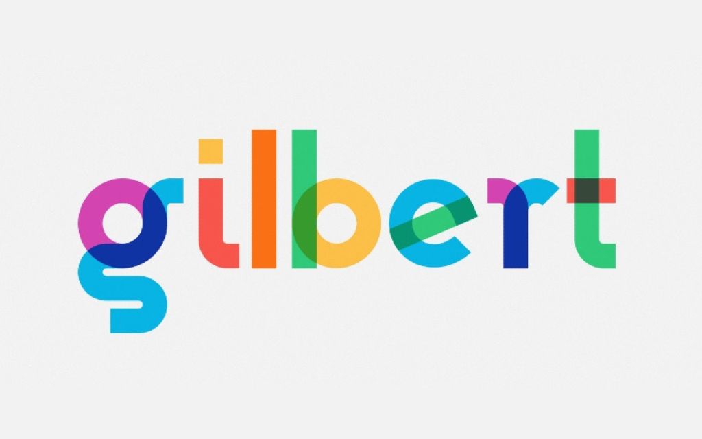
Colour Fonts
Black and white have long held the crown for minimalist cool but colour typography is beginning to make a comeback. Designers have even started combining the two, using clean design with sans serif colour fonts to bring something new and innovative to the table.
Colour is a great way to evoke emotion without saying anything (we all know the effect on our moods certain colours can have). Colour psychology is a real thing & true typography trend. It catches the eye, converting a user and building a brand identity that you can be proud of.
Conclusion
This year continues the trend of typography not only being part of the whole but the central pillar of great branding and design. We are seeing design experiments that we have never seen before. We are seeing brands pushing the envelope and destroying standards that many thought were set in stone.
And it’s working.
NEED HELP?
All sound a bit much? Don’t worry. That’s where we come in. At Competa Web Design, we provide professional website design and development services to suit any business. Contact us today to discuss your requirements.
